This stage took the longest as prior experience of using the Final Cut Pro software was in short supply, as well as the fact that we had to rifle through all the videos shot to find the ones that were suitable for the final edit. In future it would be best to number the clips in order to speed up the editing process. Once all the clips were on the timeline we had to cut them to the appropriate size in order to match the actual video’s production. Once this had been done we imported the Trouble Town mp3 file and the went about syncing the music to that of the lips in our own video and making sure these also corresponded to the cuts within our own video. This stage took the most time, due to our inexperience using the software and the fiddly nature of syncing all the clips and music together, to create an accurate lip synched video. We matched the normal conventions of a music video as not doing this when trying to replicate a real video would have had disastrous consequences. I feel the video worked well and ran smoothly.
Tuesday, 25 June 2013

2) Production (filming etc)
From the pre-production we had chosen our locations and casted our video, so with our storyboards were able to film our video, which we filmed chronologically. This started with us filming the camera from the car, which was done through the windscreen, so wasn’t as authentic and showed dirt on the glass, although it gave the effect of the real video with the speed bump and the housing estate location. In future fitting with a camera on the cars exterior could look even more authentic. We then filmed the scenes on the field using a similar location and then the scene shots of buildings (such as the tower block). We used many varied camera angles on the outdoor shots, so our video would include many fast paced authentic cuts. Getting used to the camera and its functions was relatively simple as I had used them before in previous tasks, this was the same for the use of the tripod, which gave us steady shots which looked both professional and like the actual video. The filming was probably the easiest area of the videos overall production and took the least time, as we used typical filming conventions.
1) Pre production (story boarding, prop lists etc)
We chose to re-produce the music video of Jake Buggs 'Trouble Town, as we were interested in this particular genre and the video could be produced realistically, due to minimal props being used and the location being easy to replicate in the surrounding areas. Therefore we decided to re-produce the video, as opposed to making our own impression or a parody video. Next time a more complex video could be chosen to further challenge ourselves, or to even create our own interpretation of a video or a parody. We learnt simple often looks effective and attempting to replicate something to complex could look cheap and unprofessional. We storyboarded our video to replicate the length and camera angles of shots. The storyboard gave us ideas for small changes we would have to make when replicating the video, such as not being able to include an electricity pylon. The storyboarding showed that often ideas can be easily replicated or even adjusted using limited resources to create a professional video. We then casted our video from the people in our group and planned to wear clothing that suited the genre and matched the video. Our small group fitted the videos small cast.
Wednesday, 1 May 2013
Note to Examiner
To Examiner,
I hope you enjoy reading through my AS Coursework Blog and at the work I have created. During the process I feel my knowledge of magazines has improved drastically, which I hope is represented in the development of my work.
All of my posts are labelled and ordered appropriately easing the navigation of my Blog.
Again I hope you enjoy reading my work,thank you!


Tuesday, 30 April 2013
Preliminary Magazine- 'THE Subject'.
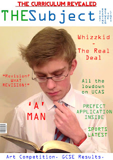
This is my preliminary front cover and contents page for my school magazine 'THE Subject'. I created it using Adobe Photoshop and used it as a great start for discovering elements and ideas to use in my final piece. Although my final magazine will be somewhat different, elements of the layout such as the Strap-lines and text around the image will be considered in my final piece.
Also everything included was done so with the intention to create an authentic school magazine, so lexis associated with school is used as is the image and the font.

Front Cover
The front cover to my Magazine features 3 colours, blue, green and red. Firstly I chose the blue and green as they are the colours of my school logo, but also because the colours represent life. Blue being the sea and green being the land. I felt this gave my magazine a lively feel, but one that wasn't manufactured one that was more authentic and natural. I also felt the two colours complimented each other well. Meanwhile I also used red to highlight the most important features upon my cover, such as the main article 'A MAN' and the top strapline "THE CURRICULUM REVEALED". I did this as it made them greatly stand out and take prominence above all else.
The font I used on magazine cover continues throughout my contents page and is somewhat a 'Geeky' font, it isn't very cool. However I felt this fit the purpose of a school magazine as it looks like a old type writers font, so it gives my publication authenticity. On the cover I did use one other font on my top strapline in order to make it bold and stand out, therefore this font is strong and powerful. Initially I had used a cooler bubble font, which had a cartoon feel to it, but it just didn't suit the feel of my school magazine at all, so I replaced it. Though it is a font I would consider on my final piece.
Furthermore the image on my front cover is one I took at home, therefore there is an unpleasant shadow, something I will not have in my final piece. It is of myself dressed as a stereotypical geek to fit the genre of the magazine. Also because of the light background I was also able to put the text freely around the image without any text boxes/backgrounds. As well because I was wearing a white shirt I could place text on here, as I have done with "A MAN" which stands out strongly and clearly.
I tried to spread the colours evenly to create a nice balance, without overloading on one colour, this is something I would like to achieve in my final piece.
Finally I added a tag line "START READING BETWEEN THE LINES" to my magazine and rotated it so it read vertically. Therefore it quite literally reads between the lines. I felt this piece of humour added a humourous element to a publication that otherwise could be perceived as boring.

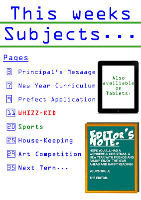
I used the same font for the contents page so I won't explain my reasoning behind that again. Although on my "EDITOR'S NOTE." section I used a bubbly font at the time to give the contents page a bit of life, whilst a bolder clearer one for the text below, to give the impression it had been written on a chalk board. Therefore I used white text and put it onto an image of a cartoon chalk board to create this authentic school effect. Whilst including an editor's note I felt gave my magazine authenticity as this features in real publications.
In addition I used blue text for all of my title and the majority of the contents, as I felt it looked better than the green as it was clearer on the white page. I continued to use blue text throughout because of this (and to continue the continuity), apart from on a few occasions. When mentioning the main article I used a red font as I had on the front cover. This was again to make it stand out but also to provide continuity throughout my magazine. Also I put the word sports in the contents into green, because of the association with sports regularly being played on a green surface, such as grass. Whilst I also used green text upon my tablet feature to avoid overloading upon the colour blue.
Furthermore I put my page numbers into boxes, to make it look like a school textbook, giving my contents page a more authentic feel. Also I felt it kept the page tidy and showed the difference between the numbers and the words that followed. Though this could have been achieved through the use of a colour change, something I will seriously consider in my final piece.
The title of my contents page is "This weeks Subjects..', which I chose because it has the obvious link of the word 'Subject' to the front cover creating continuity throughout my magazine. I also felt this would create yet more identity for my publication. Also there is the double meaning of the subjects within the magazine and the fact that subjects are what are taught at school and are the foundations of education. Much like a contents is the foundation for a magazine, the starting block.
Finally I used two green lines below each line of my contents title to make it very clear it was the title, but to more importantly fill the space, because without the lines, the page looked bare and boring.
In summary I was pleased with my preliminary piece but would hope for my final piece to look far more professional and credible. This I would hope to achieve through the use of effects on Photoshop and by taking more photos, which are also more professional and interesting. In turn helping to make my final piece more interesting, credible and most importantly authentic.
Sunday, 28 April 2013

4. Who would be the audience for your media product?
The audience for my magazine Deck are 16-30 year olds. Although this is a pretty small market, I am attempting to cater for a gap in the market, where people want to hear about music, as opposed to just reading about A list celebrities. Which is why on the Front Cover and Contents Page I have included bands/artists who are very popular with this age range, such as The Vaccines, Mumford and Sons and The Lumineers. This is because they are not only popular with my target age group, but also fit their social group of Hipsters.
Furthermore with this age range fashion is a key factor in their lifestyles, so the design of the magazine is essential to fitting the audience. As many of these people are hipsters I have attempted to dress my artists in this way, as well as designing the magazine with this in mind. If the magazine doesn't look good then the audience won't buy it, as looking good is just as important as a high quality magazine.
In addition I felt price was a decisive factor in enabling the magazine to be a success and to meet the audiences requirements. Therefore I decided to price the magazine at £2.00 as I felt this price was more than affordable for this age range, whilst was also enough to allow the production of a high quality, recognised music magazine. Crucially the magazine had to be affordable because this age range are tight for money, especially the students, so cost was essential to the publications success, because if it was too expensive readers would go elsewhere for their magazines and music news. The price also enabled me to match/better the prices of NME and Kerrang (read by this age range), as well as filling a gap in the market for the Indie genre at a reasonable price.


Name- Joe Cardkali
Age- 19
Neck of the woods- Newcastle Upon-Tyne.
Occupation- Studying Geography at Leeds Metropolitan. Not a big party animal, prefers a beer back at the flat with the boys.
Time Killers- Travels the length and breath of the UK following the Toon Army. Loves hitting gigs and went to T In The Park last summer. Can't get his hand out the biscuit tin! Not a big fan of the clubs, prefers to shop than get out of his trolley. Used to board, but that is so year 11..
Burns a hole in his pocket- Football tickets, Gig tickets, Cinema tickets. More a saver, than a big spender, but won't hold his cash if the price is right. Shops in River Island and Well Gosh. Whilst nothing beats some fresh Nikes.
Future Plans- Travel round Europe on the Interail, wants to get into town planning, but enjoys writing so journalism is an option. Just wants to have fun in the sun.
Marital Status- Single boy.
Favourite Colours- Something simple, like this, this and this.
Music to his ears- The Wombats, Friendly Fires, The Killers, The Lumineers and The XX. It's all Indie, but it's a tag he wants to brush off.
Stop press:- Likes to just get in and put his feet up, put the kettle on and let the evening roll. Get the mates round and have a laugh. Often seen popping into the high street for a window shop. Just wants to have some fun and will make the effort to find it. But for him homes where the heart is, a Geordie Lad. Howay the lads.

Furthermore with this age range fashion is a key factor in their lifestyles, so the design of the magazine is essential to fitting the audience. As many of these people are hipsters I have attempted to dress my artists in this way, as well as designing the magazine with this in mind. If the magazine doesn't look good then the audience won't buy it, as looking good is just as important as a high quality magazine.
In addition I felt price was a decisive factor in enabling the magazine to be a success and to meet the audiences requirements. Therefore I decided to price the magazine at £2.00 as I felt this price was more than affordable for this age range, whilst was also enough to allow the production of a high quality, recognised music magazine. Crucially the magazine had to be affordable because this age range are tight for money, especially the students, so cost was essential to the publications success, because if it was too expensive readers would go elsewhere for their magazines and music news. The price also enabled me to match/better the prices of NME and Kerrang (read by this age range), as well as filling a gap in the market for the Indie genre at a reasonable price.
The following are two audience profiles of people, a boy and a girl, within my target audience. I believe these people would be attracted to my magazine because of their lifestyles, likes and dislikes.
Name- Sarah Marriott.
Age- 19
Neck of the woods- Sheffield.
Occupation- Studying Textiles at Sheffield Hallam, in her second year. The partying has calmed down but the enthusiasm hasn't.
Time Killers- Never leaves the house without her camera (or her purse), she was born to shop, but tries to stick off the high street. She loves to see her friends, but "studying is taking over her whole life". Getting home to see her family is everything, but the shops in Sheffield lure her to stay from Brighton.
Burns a hole in her pocket- CLOTHES CLOTHES CLOTHES, & accessories, loves her quirky bits and bobs. However her cash is going on a new phone, as her current one is 'damaged' (so her mum thinks, a messy night being the real reason).
Future Plans- Would love to work for a fashion company, whether that be in designing or working on the photoshoot. Plus living abroad would be a dream, she'd be on that flight to New York.
Marital Status- Single and chilled.
Favourite Colours- Something that doesn't shout to loud,such as this, this & this.
Music to her ears- Laura Marling, Mumford and Sons, Two Door cinema Club, Indie and Folk YES PLEASE. But an Oasis playlist can't be sniffed out.
Stop press:- Someone who likes to be herself and doesn't want to upset others, but if she wants something she's going to get it.. watch this space!
Age- 19
Neck of the woods- Sheffield.
Occupation- Studying Textiles at Sheffield Hallam, in her second year. The partying has calmed down but the enthusiasm hasn't.
Time Killers- Never leaves the house without her camera (or her purse), she was born to shop, but tries to stick off the high street. She loves to see her friends, but "studying is taking over her whole life". Getting home to see her family is everything, but the shops in Sheffield lure her to stay from Brighton.
Burns a hole in her pocket- CLOTHES CLOTHES CLOTHES, & accessories, loves her quirky bits and bobs. However her cash is going on a new phone, as her current one is 'damaged' (so her mum thinks, a messy night being the real reason).
Future Plans- Would love to work for a fashion company, whether that be in designing or working on the photoshoot. Plus living abroad would be a dream, she'd be on that flight to New York.
Marital Status- Single and chilled.
Favourite Colours- Something that doesn't shout to loud,such as this, this & this.
Music to her ears- Laura Marling, Mumford and Sons, Two Door cinema Club, Indie and Folk YES PLEASE. But an Oasis playlist can't be sniffed out.
Stop press:- Someone who likes to be herself and doesn't want to upset others, but if she wants something she's going to get it.. watch this space!
Name- Joe Cardkali
Age- 19
Neck of the woods- Newcastle Upon-Tyne.
Occupation- Studying Geography at Leeds Metropolitan. Not a big party animal, prefers a beer back at the flat with the boys.
Time Killers- Travels the length and breath of the UK following the Toon Army. Loves hitting gigs and went to T In The Park last summer. Can't get his hand out the biscuit tin! Not a big fan of the clubs, prefers to shop than get out of his trolley. Used to board, but that is so year 11..
Burns a hole in his pocket- Football tickets, Gig tickets, Cinema tickets. More a saver, than a big spender, but won't hold his cash if the price is right. Shops in River Island and Well Gosh. Whilst nothing beats some fresh Nikes.
Future Plans- Travel round Europe on the Interail, wants to get into town planning, but enjoys writing so journalism is an option. Just wants to have fun in the sun.
Marital Status- Single boy.
Favourite Colours- Something simple, like this, this and this.
Music to his ears- The Wombats, Friendly Fires, The Killers, The Lumineers and The XX. It's all Indie, but it's a tag he wants to brush off.
Stop press:- Likes to just get in and put his feet up, put the kettle on and let the evening roll. Get the mates round and have a laugh. Often seen popping into the high street for a window shop. Just wants to have some fun and will make the effort to find it. But for him homes where the heart is, a Geordie Lad. Howay the lads.
Wednesday, 17 April 2013
Thursday, 21 March 2013
7. Looking back at your preliminary task (the continuity editing task), what do you feel you have learnt in the progression from it to full product?
Firstly I have greatly developed my skills regarding the use of software such as Photoshop. During the production of my preliminary my knowledge of the program was minimal, if any at all as I had never used such software before. Just setting up a page, let alone additional layers proved a challenge. For my Preliminary I was able to create text boxes, insert images, create shapes, but only after extensive practice and effort to achieve this. But now as well as all these skills, which I have also improved my efficiency and accuracy of completing, I have learnt to cut images to fit my magazine more suitably, enhance/edit images to improve my magazines professional look, rotate text boxes to add another dimension to my magazine and editing text professionally such as capitilising or making parts bold to enhance/emphasise them. Therefore throughout this process my work and ability to use this software has vastly improved, as my understanding of the program is now far greater. Furthermore in comparison to my Preliminary Work, the editing and authenticity of my magazine is of a much more professional standard, than I would have been able to achieve at the start of the process. I also am far more competent at completing simple tasks such as editing items and managing to complete layers completed quickly.
Secondly my knowledge of using technologies (as mentioned in question 6) has been greatly developed in order to produce my final piece. I am far more efficient on Blogger, as well as being able to use Scribd better than I previously could and develop new skills in using programs such as Animoto. Whilst with practical equipment such as cameras I am far more adept at using their features such as altering the shutter for faster shots and using the Lighting Equipment in the studio to produce high quality images. However I won't go into too much detail regarding my improved skills on technology, as this is covered in question 6.
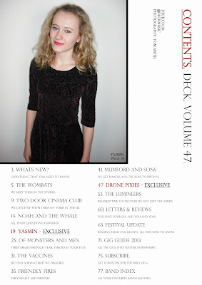
Third and finally my understanding and knowledge of the production and publication of magazines has vastly grown and improved. I gained the majority of this knowledge during the Research and Planning section of this process. In particular during my analysis of Magazines and Institutions that publish such products. I was able to learn how magazines appeal to specific audiences, as well as the techniques and conventions that they adopt, such as the use of the 3 Colour Rule. I was able to learn how things such as how the positioning of everything on the pages was designed and manipulated in order to create a aesthetically product, to meet my target audiences wishes. Due to this research when it came to my final product I was able to put this knowledge to very effective use, in order to create a credible product following real conventions and techniques, but also developing and challenging them. Unlike in my Preliminary Work, where the use of such conventions was very basic and in many cases non existent. Personally I believe my greatest improvemnt from my Preliminary Work has come in my Contents Page. The one of my Preliminary was brief and lacking in information, it didn't include any other information apart from magazine content. Whereas my final magazine includes an issue number, web address, Twitter name, images of content, accompanying captions and photography credits. With all these things my final piece was more credible and authentic, looking like a far more professional publication. Quite simply it didn't look like a magazine Contents Page in many ways, due to the lack of conventional techniques used. Things such as the text not being well aligned, the graphics being out of place and the page numbers appearing squashed in the boxes. In addition the use of a photograph in the final Contents Page makes my magazine far more conventional and makes my magazine far more authentic, especially with them being edited which makes the magazine look more credible, due to their high quality finish.
In addition I changed my usage of fonts from my Preliminary Magazine to my Final Magazine, to suit the audience more accurately. On my Preliminary Magazine the Font was quite jagged and techno, as if it was from an old type writer, in order to fit into the theme of a school magazine/ However using such a font on an Indie Music Magazine aimed at 18-30 year olds would have been inappropriate as the last thing they want to be thinking about is school in their free time. Therefore on my Final Magazine I used a classy font, which was both bold and clear, so could be read easily and quickly as my target age group don't want to waste their spare time. Whilst it was also a stylish font that suited the magazines minamilistic and relaxed feel.
Furthermore my use of images has developed significantly from my Preliminary Magazine to my Final Magazine. to suit my Indie genre accurately and to improve the quality of my publication. The image on my preliminary work was designed to suit the genre with the costume being of a school uniform and the props being a book and some glasses. Both further suiting the school theme, although they did somewhat look a bit cliche. Therefore for my final magazine I used no props in my images (e.g. a microphone) to avoid this cliche feel, whilst also maintaining my minamalistic magazine. Additionally the quality of image on my Preliminary Magazine was very low, it was done on an iPad 3 so the actual camera was to a decent standard. However the quality wasn't of that produced by using the cameras as with my final piece, which gave a superb image with a high resolution. Whilst also the photo for my preliminary was taken at home, with no white screen behind and with no proper lighting, therefore a shadow was created. But with my Final Magazine photos a white screen and professional lighting was used to enable high quality photos, enhancing and improving my magazine. Finally the poses in my Preliminary Magazine photo was very staged and appeared that way, it was far from looking natural. Whilst in my Final Magazine the poses in the images were far more relaxed and simple fitting the genre, as well as the minamalitsic style. This also made my magazine look far more authentic and credible that my preliminary piece.
Overall by just quickly looking at my Contents Page, it is clear the development I have managed to achieve in producing my magazine and how my understanding of magazines has improved and most importantly contributed to the former. Therefore not only do I feel I have learnt a lot in this process but I believe I have been able to put all of this to good use.
6. What have you learnt about technologies from the process of constructing this product?
Photoshop- I used this program to design and create my Magazine Publication. Each of my pages was created on Photoshop as you are able to layer all the individual elements of the pages over each other, to create your own desired effect.. I used it to edit all my photos (using the lasso tool to crop images and to adjust brightness/exposure of my images), create a layout for my magazine, create shapes (such as picture frames) and select/use fonts to enhance my magazines authenticity. The most useful tool I used was the colour picker, which allowed me to take the colour from my cover stars nail varnish and allowed me to use this on my text headings in order to create accurate continuity in my magazine. Before this work I hadn't used Photoshop before so to start with I was very slow in producing work on the program, whilst I was also very limited in my ability to use the different tools and techniques available on the software. Although I now feel far more competent in using the software and feel I used it to the best of my ability for my magazine.
I also downloaded the free 30 day Photoshop Trial to my home laptop, which enabled me to use the same software at home.

Cameras- The cameras that I used were both extremely helpful in enabling me to take high quality photos for my magazine, using different shot types, even though I had little photography experience. The CAMERA with more megapixels was used on my Front Cover and Double Page Spread, meanwhile the CAMERA with fewer megapixels was used on my Contents Page. Although I feel the change in equipment had no detrimental effect to the resolution of my photos, or the magazines finish. Firstly the cameras were not difficult to use, but took a short amount of time discovering their features and how to use them, such as the flash and the zoom, however once these were established the use of the cameras was easy.
Computers/ Laptop- I used both the school and my own personal laptop to produce my coursework. My personal laptop is a DELL Inspiron These were used for researching my target audience, music genre, and to gain inspiration for my own magazine. Essentially I learnt nothing new from using this technology, however I did learn a great deal about the programmes I utilised on them.

Blogger- This is the second time I had used Blogger, therefore my knowledge on how to use it was already developed. However during this process I feel my ability to use it successfully has increased. Such as using Labels to group my posts making locating them easier and by setting up my blog in a user friendly way to aid my success. I posted each and every stage of my Coursework on to my blog, from my preliminary task to the evaluation now.

Scribd- I used Scribd for the purpose of uploading any long documents to my blog that had been done on Microsoft Word, as I could manipulate text and images more easily this way. Such as my magazine analysis, of existing publications. I had used it before, but can now use it more efficiently.

Animoto- I used Animoto to create mood boards in a modern way, as opposed to cutting and sticking. I thought it worked really well and gave what could essentially look boring a item on my blog a current and up to date feel. This is a website I hadn’t previously used, but found it really easy to pick up and use, whilst still creating a piece of work that looked professional.

Microsoft Word 2007- I used this software in order to write up my Double Page Spread article. I chose to do this as I thought it would work best on a word document as it would encourage me to focus solely on my articles quality, as opposed to getting disttacted on Photoshop, by just making it look good. I was also able to use the spell check and thesaurus facilties on the program to improve my texts article and I was able to keep a word count of how much I had done. I had used this softaware before so didn’t learn anything new, although my typing speed has increased.

Twitter- I posted some jpeg’s of saved Photoshop files of the 3 components of my magazine on to twitter too see what my friends and other follwoers thought and which features they liked and those which they didn’t. All of my friends and most of my followers of they are my target audience, i felt there opinion would be most valid. I had used Twitter before this process, therefore I used my existing twitter account for this.

Internet (Google Chrome/internet explorer, Google.com)- I used all of these services as an essential part of my research and planning. The search engine Google was superb in helping me fine magazine examples, information on institution and appropriate images for my blog. Whilst the two Web Providers were brilliant in providing these favilities. I had used these all before so was able to use them efficiently and competently.


Lighting equipment- I used lighting when taking images for my magazine in order to make the images look far more professional and authentic. Meanwhile it made the images of higher quality, due to the fact that the lighting enhaced my images, giving my artists the look of someone that was natural infront of the camera, all helping to enhance my works authenticity. I had not used lighting before but it was really easy to set up and had a positive effect on my images.
Scanner- I used the scanner once when uploading a copy of my Brainstorm for magazines, this showed they were all my own ideas and my creativity. Whilst it also produced a better quality image for my blog, as opposed to one taken on a camera. I hadn't used the Scanner before this, but after being shown once how it worked I found it very easy and efficient to use, enhancing my Blog.
Ipad 3- I used this when taking the photos for my Prelimary Magazine, as the camera was of a reasonable standard for the prelim. It also meant I was able to do this work from home, making this part of the process more efficient. I had used the camera on the iPad before, so this was easy to use and I was able to simply crop the images how I wanted, making the use of this technology quick and simple.

I also downloaded the free 30 day Photoshop Trial to my home laptop, which enabled me to use the same software at home.
Cameras- The cameras that I used were both extremely helpful in enabling me to take high quality photos for my magazine, using different shot types, even though I had little photography experience. The CAMERA with more megapixels was used on my Front Cover and Double Page Spread, meanwhile the CAMERA with fewer megapixels was used on my Contents Page. Although I feel the change in equipment had no detrimental effect to the resolution of my photos, or the magazines finish. Firstly the cameras were not difficult to use, but took a short amount of time discovering their features and how to use them, such as the flash and the zoom, however once these were established the use of the cameras was easy.
Computers/ Laptop- I used both the school and my own personal laptop to produce my coursework. My personal laptop is a DELL Inspiron These were used for researching my target audience, music genre, and to gain inspiration for my own magazine. Essentially I learnt nothing new from using this technology, however I did learn a great deal about the programmes I utilised on them.
Blogger- This is the second time I had used Blogger, therefore my knowledge on how to use it was already developed. However during this process I feel my ability to use it successfully has increased. Such as using Labels to group my posts making locating them easier and by setting up my blog in a user friendly way to aid my success. I posted each and every stage of my Coursework on to my blog, from my preliminary task to the evaluation now.
Scribd- I used Scribd for the purpose of uploading any long documents to my blog that had been done on Microsoft Word, as I could manipulate text and images more easily this way. Such as my magazine analysis, of existing publications. I had used it before, but can now use it more efficiently.
Animoto- I used Animoto to create mood boards in a modern way, as opposed to cutting and sticking. I thought it worked really well and gave what could essentially look boring a item on my blog a current and up to date feel. This is a website I hadn’t previously used, but found it really easy to pick up and use, whilst still creating a piece of work that looked professional.
Microsoft Word 2007- I used this software in order to write up my Double Page Spread article. I chose to do this as I thought it would work best on a word document as it would encourage me to focus solely on my articles quality, as opposed to getting disttacted on Photoshop, by just making it look good. I was also able to use the spell check and thesaurus facilties on the program to improve my texts article and I was able to keep a word count of how much I had done. I had used this softaware before so didn’t learn anything new, although my typing speed has increased.
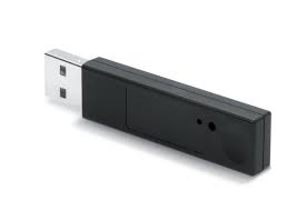
Memory
Stick- As well as this being a back up device to save documnents/files which
were also on both my laptop and the school computers, it also enabled me to
transport files easily and quickly without having to use Outlook for example.
This allowed me as much time as possible to complete my work successfully. I
had used this device before to improve efficiency.
Twitter- I posted some jpeg’s of saved Photoshop files of the 3 components of my magazine on to twitter too see what my friends and other follwoers thought and which features they liked and those which they didn’t. All of my friends and most of my followers of they are my target audience, i felt there opinion would be most valid. I had used Twitter before this process, therefore I used my existing twitter account for this.
Internet (Google Chrome/internet explorer, Google.com)- I used all of these services as an essential part of my research and planning. The search engine Google was superb in helping me fine magazine examples, information on institution and appropriate images for my blog. Whilst the two Web Providers were brilliant in providing these favilities. I had used these all before so was able to use them efficiently and competently.
Lighting equipment- I used lighting when taking images for my magazine in order to make the images look far more professional and authentic. Meanwhile it made the images of higher quality, due to the fact that the lighting enhaced my images, giving my artists the look of someone that was natural infront of the camera, all helping to enhance my works authenticity. I had not used lighting before but it was really easy to set up and had a positive effect on my images.
Scanner- I used the scanner once when uploading a copy of my Brainstorm for magazines, this showed they were all my own ideas and my creativity. Whilst it also produced a better quality image for my blog, as opposed to one taken on a camera. I hadn't used the Scanner before this, but after being shown once how it worked I found it very easy and efficient to use, enhancing my Blog.
Ipad 3- I used this when taking the photos for my Prelimary Magazine, as the camera was of a reasonable standard for the prelim. It also meant I was able to do this work from home, making this part of the process more efficient. I had used the camera on the iPad before, so this was easy to use and I was able to simply crop the images how I wanted, making the use of this technology quick and simple.
Wednesday, 20 March 2013
5. How did you attract/address your audience?
My audience ranges between old teenagers to young adults aged from 16-30, so I have designed my magazine with this audience in mind at all times in order to get them to buy my magazine. Such as using artists in my magazine that both fall into the target age range, so the audience relate to them easily. My audience is not gender specific so when attracting my audience I had to bear this in mind, as to not favour one gender over the other. Therefore although I have used a female cover star and a female on the contents, I have kept the colours on both the costume and the magazines graphology gender neutral. The colours also coordinate with the magazines graphology making the magazine quite stylized.As well the cover stars pose isn't feminine (such as flirtatious), in fact with crossed arms it could be seen as quite masculine. So with a female doing this the magazine remains gender neutral. Whilst the facial expressions on both my artists are gender neutral, neither of them are over the top or silly. Meanwhile the cover lines on my magazine feature 6 male artists and just one female artist with one artist (The Lumineers) comprising of both male and female. Seemingly this would attract my magazine far more to males, however the cover star is female and so is the contents artist so these balance out that there are more males on the cover lines. Whilst also the audience is interested in these artists, so they have to be included and there aren't as many female artists in this genre, therefore the balance between male and female would be difficult to achieve. Obviously there isn't a great deal else on the cover due to my minamlistic style however, this age group won't loads of useless information they will just want the nesscessities, again suiting the minimal style and audience. Though the price will attract the audience, as at only £2 it is a very good price for an age group struggling for cash and in a competitive magazine market.
I designed my contents as I did, because I suspected my readership would be semi literate in the genre of music and lexis regarding music, such as there meanings. For example "studio" and "tour". Therefore the brief descriptions which accompany the headings in the contents will be understood clearly. The reader would also be able to follow the mainly formal language used throughout my pages, because of their age and education. Also I believe the images I have used within my piece would appear attractive to the audience as they are all of young, successful/soon to be or upcoming artists who they would aspire to be like, as well as being able to relate to them because of their age similarities. The fact that my Double Page Spread gives readers a deeper more personal insight into Drone Pixies, is something that I feel would greatly attract my audience. Especially when it comes to the less formal questions, such as "How do you tend to relax?" and "Do you have any hidden talents?". These build up a rapport with the artist and knowing the personal details, allows the reader to feel more involved and more in the know, something my audience (in particular Hipsters) crave for, as they like to know things first before it slips into the mainstream radar. Furthermore questions are asked regarding gigs and festivals, which is important for two reasons. Firstly my 16-30 target age group are the most likely to be attending such events, so they will want this information. Secondly giving them this information makes them (Hipsters) feel in the know, this way they feel ahead of the game as this information may not be available elsewhere. Therefore here I have addressed the audiences needs. The language I have adopted in the interview would address my audience because of my interview style. The background to Emily's life is important as it makes the Hipsters feel in the know and ahead of the game. Whilst the question and answer section further reaffirms this point. Furthermore the speech of the youthful artist featured would effectively address to my audience, as the sociolect used would match that of the audience and further build a close relationship with the reader, all further attracting them to the magazine. I also feel the interview represents my artist very positively, by focusing on qualities such as "The down to earth conversation", which allows my audience to respect the artist. Something I feel they will be grateful, as often young people don't feel they are respected or seen in a positive light, so here I have addressed that issue.
In addition I feel the photograph I have chosen for my Double Page Spread will address my audience well. The natural pose is very welcoming and doesn't attempt to be something that it isn't such as faking a smile. It suits my audience as they will be relaxed in this way and won't like poses that are simply done for effect or popularity/publicity. Furthermore the cover lines I have used on my Double Page Spread were all created with my audience in mind. The first one “I didn't meet my Dad until I was 17, I wish I never had." is a huge insight into Emily's upbringing and is something you wouldn't discover unless you read the magazine. Therefore this makes the audience feel ahead of the game and in the know, finding something out before everybody else does. This addresses my audience well as most of them are Hipsters and have to find things out first, before they become too popular. The second and third cover lines have a slightly different effect in terms of addressing the reader, “it was something I couldn't have dreamed of” and “I genuinely couldn't believe it!”. They are both used to create excitement and intrigue with the reader, without giving too much away. I didn't need to give a great deal away, as with most of my audience being hipsters, they are willing to put in the leg work and find out for themselves by reading the article. For my article I chose to do questions and answers as I felt this most suited my age range, as they are not willing to get bogged down in heavy, uninspiring text. Although I did start with a few paragraphs of introduction to my artist, as I believed this was appropriate with a new artist, whilst it also suited the Hipster audience who like to be in the know. Familiarly the questions and answers also address my audience as it provides them with information about the artist straight away and keeps them in my know. Therefore the very informative style of my article in providing information right away to the audience attracts Hipsters as this suits their needs to be in the know, before anybody else.
In conclusion, I believe I have tried a lot of methods in an attempt to attract and address my target audience, in a way they would appreciate and understand. I feel I have managed this by studying the age group and their mannerisms closely through my Audience Research and Audience Profiles, in order to create a publication that is both suited to their needs (e.g price) and wishes (e.g design). Whilst I also spent time conducting audience feedback upon my first draft magazine within my target age group, in order to create a product that accurately addressed my audience. As well I looked at how I was going to represent my artist, in order to attract my audience, such as the costume, poses and tone of article. Therefore by combining all these components together has allowed me to create a Magazine that will both attract and address my audience.
I designed my contents as I did, because I suspected my readership would be semi literate in the genre of music and lexis regarding music, such as there meanings. For example "studio" and "tour". Therefore the brief descriptions which accompany the headings in the contents will be understood clearly. The reader would also be able to follow the mainly formal language used throughout my pages, because of their age and education. Also I believe the images I have used within my piece would appear attractive to the audience as they are all of young, successful/soon to be or upcoming artists who they would aspire to be like, as well as being able to relate to them because of their age similarities. The fact that my Double Page Spread gives readers a deeper more personal insight into Drone Pixies, is something that I feel would greatly attract my audience. Especially when it comes to the less formal questions, such as "How do you tend to relax?" and "Do you have any hidden talents?". These build up a rapport with the artist and knowing the personal details, allows the reader to feel more involved and more in the know, something my audience (in particular Hipsters) crave for, as they like to know things first before it slips into the mainstream radar. Furthermore questions are asked regarding gigs and festivals, which is important for two reasons. Firstly my 16-30 target age group are the most likely to be attending such events, so they will want this information. Secondly giving them this information makes them (Hipsters) feel in the know, this way they feel ahead of the game as this information may not be available elsewhere. Therefore here I have addressed the audiences needs. The language I have adopted in the interview would address my audience because of my interview style. The background to Emily's life is important as it makes the Hipsters feel in the know and ahead of the game. Whilst the question and answer section further reaffirms this point. Furthermore the speech of the youthful artist featured would effectively address to my audience, as the sociolect used would match that of the audience and further build a close relationship with the reader, all further attracting them to the magazine. I also feel the interview represents my artist very positively, by focusing on qualities such as "The down to earth conversation", which allows my audience to respect the artist. Something I feel they will be grateful, as often young people don't feel they are respected or seen in a positive light, so here I have addressed that issue.
In addition I feel the photograph I have chosen for my Double Page Spread will address my audience well. The natural pose is very welcoming and doesn't attempt to be something that it isn't such as faking a smile. It suits my audience as they will be relaxed in this way and won't like poses that are simply done for effect or popularity/publicity. Furthermore the cover lines I have used on my Double Page Spread were all created with my audience in mind. The first one “I didn't meet my Dad until I was 17, I wish I never had." is a huge insight into Emily's upbringing and is something you wouldn't discover unless you read the magazine. Therefore this makes the audience feel ahead of the game and in the know, finding something out before everybody else does. This addresses my audience well as most of them are Hipsters and have to find things out first, before they become too popular. The second and third cover lines have a slightly different effect in terms of addressing the reader, “it was something I couldn't have dreamed of” and “I genuinely couldn't believe it!”. They are both used to create excitement and intrigue with the reader, without giving too much away. I didn't need to give a great deal away, as with most of my audience being hipsters, they are willing to put in the leg work and find out for themselves by reading the article. For my article I chose to do questions and answers as I felt this most suited my age range, as they are not willing to get bogged down in heavy, uninspiring text. Although I did start with a few paragraphs of introduction to my artist, as I believed this was appropriate with a new artist, whilst it also suited the Hipster audience who like to be in the know. Familiarly the questions and answers also address my audience as it provides them with information about the artist straight away and keeps them in my know. Therefore the very informative style of my article in providing information right away to the audience attracts Hipsters as this suits their needs to be in the know, before anybody else.
In conclusion, I believe I have tried a lot of methods in an attempt to attract and address my target audience, in a way they would appreciate and understand. I feel I have managed this by studying the age group and their mannerisms closely through my Audience Research and Audience Profiles, in order to create a publication that is both suited to their needs (e.g price) and wishes (e.g design). Whilst I also spent time conducting audience feedback upon my first draft magazine within my target age group, in order to create a product that accurately addressed my audience. As well I looked at how I was going to represent my artist, in order to attract my audience, such as the costume, poses and tone of article. Therefore by combining all these components together has allowed me to create a Magazine that will both attract and address my audience.
Monday, 18 March 2013
4. Who would be the audience for your media product?
The audience for my magazine Deck are 16-30 year olds. Although this is a pretty small market, I am attempting to cater for a gap in the market, where people want to hear about music, as opposed to just reading about A list celebrities. Which is why on the Front Cover and Contents Page I have included bands/artists who are very popular with this age range, such as The Vaccines, Mumford and Sons and The Lumineers. This is because they are not only popular with my target age group, but also fit their social group of Hipsters.
Furthermore with this age range fashion is a key factor in their lifestyles, so the design of the magazine is essential to fitting the audience. As many of these people are hipsters I have attempted to dress my artists in this way, as well as designing the magazine with this in mind. If the magazine doesn't look good then the audience won't buy it, as looking good is just as important as a high quality magazine.
In addition I felt price was a decisive factor in enabling the magazine to be a success and to meet the audiences requirements. Therefore I decided to price the magazine at £2.00 as I felt this price was more than affordable for this age range, whilst was also enough to allow the production of a high quality, recognised music magazine. Crucially the magazine had to be affordable because this age range are tight for money, especially the students, so cost was essential to the publications success, because if it was too expensive readers would go elsewhere for their magazines and music news. The price also enabled me to match/better the prices of NME and Kerrang (read by this age range), as well as filling a gap in the market for the Indie genre at a reasonable price.
Name- Joe Cardkali
Age- 19
Neck of the woods- Newcastle Upon-Tyne.
Occupation- Studying Geography at Leeds Metropolitan. Not a big party animal, prefers a beer back at the flat with the boys.
Time Killers- Travels the length and breath of the UK following the Toon Army. Loves hitting gigs and went to T In The Park last summer. Can't get his hand out the biscuit tin! Not a big fan of the clubs, prefers to shop than get out of his trolley. Used to board, but that is so year 11..
Burns a hole in his pocket- Football tickets, Gig tickets, Cinema tickets. More a saver, than a big spender, but won't hold his cash if the price is right. Shops in River Island and Well Gosh. Whilst nothing beats some fresh Nikes.
Future Plans- Travel round Europe on the Interail, wants to get into town planning, but enjoys writing so journalism is an option. Just wants to have fun in the sun.
Marital Status- Single boy.
Favourite Colours- Something simple, like this, this and this.
Music to his ears- The Wombats, Friendly Fires, The Killers, The Lumineers and The XX. It's all Indie, but it's a tag he wants to brush off.
Stop press:- Likes to just get in and put his feet up, put the kettle on and let the evening roll. Get the mates round and have a laugh. Often seen popping into the high street for a window shop. Just wants to have some fun and will make the effort to find it. But for him homes where the heart is, a Geordie Lad. Howay the lads.
Furthermore with this age range fashion is a key factor in their lifestyles, so the design of the magazine is essential to fitting the audience. As many of these people are hipsters I have attempted to dress my artists in this way, as well as designing the magazine with this in mind. If the magazine doesn't look good then the audience won't buy it, as looking good is just as important as a high quality magazine.
In addition I felt price was a decisive factor in enabling the magazine to be a success and to meet the audiences requirements. Therefore I decided to price the magazine at £2.00 as I felt this price was more than affordable for this age range, whilst was also enough to allow the production of a high quality, recognised music magazine. Crucially the magazine had to be affordable because this age range are tight for money, especially the students, so cost was essential to the publications success, because if it was too expensive readers would go elsewhere for their magazines and music news. The price also enabled me to match/better the prices of NME and Kerrang (read by this age range), as well as filling a gap in the market for the Indie genre at a reasonable price.
The following are two audience profiles of people, a boy and a girl, within my target audience. I believe these people would be attracted to my magazine because of their lifestyles, likes and dislikes.
Name- Sarah Marriott.
Age- 19
Neck of the woods- Sheffield.
Occupation- Studying Textiles at Sheffield Hallam, in her second year. The partying has calmed down but the enthusiasm hasn't.
Time Killers- Never leaves the house without her camera (or her purse), she was born to shop, but tries to stick off the high street. She loves to see her friends, but "studying is taking over her whole life". Getting home to see her family is everything, but the shops in Sheffield lure her to stay from Brighton.
Burns a hole in her pocket- CLOTHES CLOTHES CLOTHES, & accessories, loves her quirky bits and bobs. However her cash is going on a new phone, as her current one is 'damaged' (so her mum thinks, a messy night being the real reason).
Future Plans- Would love to work for a fashion company, whether that be in designing or working on the photoshoot. Plus living abroad would be a dream, she'd be on that flight to New York.
Marital Status- Single and chilled.
Favourite Colours- Something that doesn't shout to loud,such as this, this & this.
Music to her ears- Laura Marling, Mumford and Sons, Two Door cinema Club, Indie and Folk YES PLEASE. But an Oasis playlist can't be sniffed out.
Stop press:- Someone who likes to be herself and doesn't want to upset others, but if she wants something she's going to get it.. watch this space!
Age- 19
Neck of the woods- Sheffield.
Occupation- Studying Textiles at Sheffield Hallam, in her second year. The partying has calmed down but the enthusiasm hasn't.
Time Killers- Never leaves the house without her camera (or her purse), she was born to shop, but tries to stick off the high street. She loves to see her friends, but "studying is taking over her whole life". Getting home to see her family is everything, but the shops in Sheffield lure her to stay from Brighton.
Burns a hole in her pocket- CLOTHES CLOTHES CLOTHES, & accessories, loves her quirky bits and bobs. However her cash is going on a new phone, as her current one is 'damaged' (so her mum thinks, a messy night being the real reason).
Future Plans- Would love to work for a fashion company, whether that be in designing or working on the photoshoot. Plus living abroad would be a dream, she'd be on that flight to New York.
Marital Status- Single and chilled.
Favourite Colours- Something that doesn't shout to loud,such as this, this & this.
Music to her ears- Laura Marling, Mumford and Sons, Two Door cinema Club, Indie and Folk YES PLEASE. But an Oasis playlist can't be sniffed out.
Stop press:- Someone who likes to be herself and doesn't want to upset others, but if she wants something she's going to get it.. watch this space!
Name- Joe Cardkali
Age- 19
Neck of the woods- Newcastle Upon-Tyne.
Occupation- Studying Geography at Leeds Metropolitan. Not a big party animal, prefers a beer back at the flat with the boys.
Time Killers- Travels the length and breath of the UK following the Toon Army. Loves hitting gigs and went to T In The Park last summer. Can't get his hand out the biscuit tin! Not a big fan of the clubs, prefers to shop than get out of his trolley. Used to board, but that is so year 11..
Burns a hole in his pocket- Football tickets, Gig tickets, Cinema tickets. More a saver, than a big spender, but won't hold his cash if the price is right. Shops in River Island and Well Gosh. Whilst nothing beats some fresh Nikes.
Future Plans- Travel round Europe on the Interail, wants to get into town planning, but enjoys writing so journalism is an option. Just wants to have fun in the sun.
Marital Status- Single boy.
Favourite Colours- Something simple, like this, this and this.
Music to his ears- The Wombats, Friendly Fires, The Killers, The Lumineers and The XX. It's all Indie, but it's a tag he wants to brush off.
Stop press:- Likes to just get in and put his feet up, put the kettle on and let the evening roll. Get the mates round and have a laugh. Often seen popping into the high street for a window shop. Just wants to have some fun and will make the effort to find it. But for him homes where the heart is, a Geordie Lad. Howay the lads.
3. What kind of media institution might distribute your media product and why?
After looking at the 3 main institutions involved within the publication of magazines for the Music industry, I have come to the conclusion that IPC Media would be most suited to publishing my final piece music magazine. They are currently experiencing major success with NME and reach out to 26 million adults a month. Whilst also having success with online magazines which could add another dimension to my magazine, in a generation where going online is massive.
Meanwhile there is a gap in the market for a Hipster Music Magazine aimed at 16-30 year olds, therefore I feel that IPC Media could take my magazine and make it a great success by tapping into a gap in the market. Also with their online success, this could be ideal for my magazine as Hipsters often prefer to find things online or download magazines onto their Tablets. As a result being the first to find it and setting a trend, as opposed to just buying the magazine in a newsagents as anybody can do.

Meanwhile there is a gap in the market for a Hipster Music Magazine aimed at 16-30 year olds, therefore I feel that IPC Media could take my magazine and make it a great success by tapping into a gap in the market. Also with their online success, this could be ideal for my magazine as Hipsters often prefer to find things online or download magazines onto their Tablets. As a result being the first to find it and setting a trend, as opposed to just buying the magazine in a newsagents as anybody can do.
So with their outstanding publishing reputation I believe they could take my magazine far within the open market place due to their great credibility and reputation within the market, as well as their know how regarding new publications.
2. How does your media product represent particular social groups ?
In terms of social groups my Magazine represents Hipsters, as my magazine both suits and fits the characteristics of this particular social group. Although this social group is generally associated with boys, female hipsters certainly exist. Therefore having a female on the cover, will appeal to girls predominantly (and boys), whilst the style of the magazine will appeal to hipsters in general.
They also tend to be urban people, which links to my Double Page Spread, as Drone Pixies herself is from Urban Leicester. As well she is understated and doesn't attempt to follow to many mainstream fashion ideas, by keeping her costume simple, but still stylish without drawing too much attention to herself. A style that is difficult to copy and pull off well, therefore suiting the Hipsters as it can't slip into the mainstream radar. Also the upbeat tone of Emily's question and answer interview gives off the energetic vibe Hipsters wish to portray and how they don't stand still, looking for the next big thing.
They consider themselves to be ahead of the game and trendsetters, as a result a magazine that features a new artist is ideal, as it gives the target group the feeling of discovering them and that they set the trend to like this artist. This fits as this particular group are only interested in things that slip under the mainstream radar, as once something becomes widely known and popular it's ditched.
Furthermore apart from Fantastic Man the style of my Front Cover is unconventional therefore suiting hipsters as they are adventurous in their choices and enthusiastic regarding new ideas in order to stay away from mainstream ideas. For example if my magazine had a more conventional Front Cover, the social group would be uninterested. Hipsters want to be fitting between ideas, rather than sticking to conventions, much like my magazine, as well as remaining current with trends and crazes. As I have taken ideas from a few different publications to create something new that is new and unique.
Finally, currently Hipsters are ditching their Digitals for their Polaroids, which fits my magazine as two of the three images used are framed, giving the retro effect that hipsters are currently trying to achieve.

They also tend to be urban people, which links to my Double Page Spread, as Drone Pixies herself is from Urban Leicester. As well she is understated and doesn't attempt to follow to many mainstream fashion ideas, by keeping her costume simple, but still stylish without drawing too much attention to herself. A style that is difficult to copy and pull off well, therefore suiting the Hipsters as it can't slip into the mainstream radar. Also the upbeat tone of Emily's question and answer interview gives off the energetic vibe Hipsters wish to portray and how they don't stand still, looking for the next big thing.
They consider themselves to be ahead of the game and trendsetters, as a result a magazine that features a new artist is ideal, as it gives the target group the feeling of discovering them and that they set the trend to like this artist. This fits as this particular group are only interested in things that slip under the mainstream radar, as once something becomes widely known and popular it's ditched.
Furthermore apart from Fantastic Man the style of my Front Cover is unconventional therefore suiting hipsters as they are adventurous in their choices and enthusiastic regarding new ideas in order to stay away from mainstream ideas. For example if my magazine had a more conventional Front Cover, the social group would be uninterested. Hipsters want to be fitting between ideas, rather than sticking to conventions, much like my magazine, as well as remaining current with trends and crazes. As I have taken ideas from a few different publications to create something new that is new and unique.
Finally, currently Hipsters are ditching their Digitals for their Polaroids, which fits my magazine as two of the three images used are framed, giving the retro effect that hipsters are currently trying to achieve.
Subscribe to:
Posts (Atom)