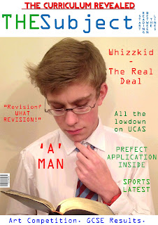
This is my preliminary front cover and contents page for my school magazine 'THE Subject'. I created it using Adobe Photoshop and used it as a great start for discovering elements and ideas to use in my final piece. Although my final magazine will be somewhat different, elements of the layout such as the Strap-lines and text around the image will be considered in my final piece.
Also everything included was done so with the intention to create an authentic school magazine, so lexis associated with school is used as is the image and the font.
Front Cover
The front cover to my Magazine features 3 colours, blue, green and red. Firstly I chose the blue and green as they are the colours of my school logo, but also because the colours represent life. Blue being the sea and green being the land. I felt this gave my magazine a lively feel, but one that wasn't manufactured one that was more authentic and natural. I also felt the two colours complimented each other well. Meanwhile I also used red to highlight the most important features upon my cover, such as the main article 'A MAN' and the top strapline "THE CURRICULUM REVEALED". I did this as it made them greatly stand out and take prominence above all else.
The font I used on magazine cover continues throughout my contents page and is somewhat a 'Geeky' font, it isn't very cool. However I felt this fit the purpose of a school magazine as it looks like a old type writers font, so it gives my publication authenticity. On the cover I did use one other font on my top strapline in order to make it bold and stand out, therefore this font is strong and powerful. Initially I had used a cooler bubble font, which had a cartoon feel to it, but it just didn't suit the feel of my school magazine at all, so I replaced it. Though it is a font I would consider on my final piece.
Furthermore the image on my front cover is one I took at home, therefore there is an unpleasant shadow, something I will not have in my final piece. It is of myself dressed as a stereotypical geek to fit the genre of the magazine. Also because of the light background I was also able to put the text freely around the image without any text boxes/backgrounds. As well because I was wearing a white shirt I could place text on here, as I have done with "A MAN" which stands out strongly and clearly.
I tried to spread the colours evenly to create a nice balance, without overloading on one colour, this is something I would like to achieve in my final piece.
Finally I added a tag line "START READING BETWEEN THE LINES" to my magazine and rotated it so it read vertically. Therefore it quite literally reads between the lines. I felt this piece of humour added a humourous element to a publication that otherwise could be perceived as boring.
I used the same font for the contents page so I won't explain my reasoning behind that again. Although on my "EDITOR'S NOTE." section I used a bubbly font at the time to give the contents page a bit of life, whilst a bolder clearer one for the text below, to give the impression it had been written on a chalk board. Therefore I used white text and put it onto an image of a cartoon chalk board to create this authentic school effect. Whilst including an editor's note I felt gave my magazine authenticity as this features in real publications.
In addition I used blue text for all of my title and the majority of the contents, as I felt it looked better than the green as it was clearer on the white page. I continued to use blue text throughout because of this (and to continue the continuity), apart from on a few occasions. When mentioning the main article I used a red font as I had on the front cover. This was again to make it stand out but also to provide continuity throughout my magazine. Also I put the word sports in the contents into green, because of the association with sports regularly being played on a green surface, such as grass. Whilst I also used green text upon my tablet feature to avoid overloading upon the colour blue.
Furthermore I put my page numbers into boxes, to make it look like a school textbook, giving my contents page a more authentic feel. Also I felt it kept the page tidy and showed the difference between the numbers and the words that followed. Though this could have been achieved through the use of a colour change, something I will seriously consider in my final piece.
The title of my contents page is "This weeks Subjects..', which I chose because it has the obvious link of the word 'Subject' to the front cover creating continuity throughout my magazine. I also felt this would create yet more identity for my publication. Also there is the double meaning of the subjects within the magazine and the fact that subjects are what are taught at school and are the foundations of education. Much like a contents is the foundation for a magazine, the starting block.
Finally I used two green lines below each line of my contents title to make it very clear it was the title, but to more importantly fill the space, because without the lines, the page looked bare and boring.
In summary I was pleased with my preliminary piece but would hope for my final piece to look far more professional and credible. This I would hope to achieve through the use of effects on Photoshop and by taking more photos, which are also more professional and interesting. In turn helping to make my final piece more interesting, credible and most importantly authentic.


