Tuesday 29 January 2013

Research of Institutions.


  • Bauer Media Group is a multinational media company  who are headquarted in Hamburg, Germany. As of now they operate in 15 countries globally.

  • Ever since the company was founded in 1875, it has been privately owned and under management by the Bauer family.

  • Currently Worldwide circulation of Bauer Media Group's magazine titles amounts to 38 million magazines a week.

  • It currently owns magazines such as, Kerrang, FHM, Q, MOJO, as well a the rights o television channel '4 Music'.


IPC Media.png

  • IPC Media ( who were formerly named International Publishing Corporation),   are a fully  owned subsidiary of Time Inc. 

  • Within the United Kingdom they are a major consumer magazine and digital publisher, with an ever expanding  portfolio selling a staggering 350 million copies each year.

  • The company has many Diversions, these include: ICP Newspapers, ICP magazines, ICP Trade and Technical,  ICP Printing, ICP Books and  ICP New Products.

  • As well as doing many magazines in the  traditional physical format, they now also use many other platforms, such as online magazines and downloads. 

  • Current;y they are United Kingdom's number 1 consumer magazine publisher, due to the 26 million adults there are selling magazines to.. Meanwhile their online magazines bring in over 25 million views every month. 

  • ICP are most famous for their award winning music magazine NME. As a  publication it is read by a monumental 1.1 million people each and every week, as well it is the longest published and one of the biggest music magazine's worldwide. 

  • However the magazine also has a website running parallel, http://www.nme.com/ provides online users the opportunity to go and read the newest edition of the magazine. 

  • In addition the opportunity is their to look back over every issue that has been published within the last 60 years since the magazine was published.

  • Examples of the magazines which they publish include NME and Loaded
    
File:Hearst Corporation.svg

  • The Hearst Corporation is an American mass media group based in the Hearst Tower, Manhattan in New York City, New York, United States.

  • Founded by William Randolph Hearst as an owner of newspapers, the company's holdings now include a wide variety of media. The Hearst family is involved in the ownership and management of the company.

  • Hearst is one of the largest diversified communications companies in the world. Its major interests include 15 daily and 36 weekly newspapers, and more than 300 magazines around the world.

  • Hearst both publishes and produces various magazines, such as, ELLE, Esquire, Cosmopolitan and Marie Clarie.


Conclusion

After looking at the 3 main magazines involved within the Music industry, I have come to the conclusion that IPC Media would be most suited to publishing my final piece music magazine. They are currently experiencing  major success with NME and reach out to 26 million adults a month. Whilst also having success with online magazines which could add another dimension to my magazine, in a generation where going online is massive. 

So with their outstanding publishing reputation I believe they could take my magazine far within the market place due to their great credibility and reputation within the market. 


I

Sunday 27 January 2013

25 Word Pitch and Animoto Video Pitch.

My magazine will be of an Indie genre,aimed at young adults. It will be titled 'Deck' and will cost £2.00 weekly. It will consist of 80 pages.


Make your own slideshow at Animoto.

Audience Research.


The target audience for my final piece magazine will be aimed at consumers who are interested in both Indie and Folk Music. I have established that these people are aged from around 16 to 30. This tends to be because at the age of 16 people are given more freedom to express themselves, whilst at the age of 30 people are likely to settle down and have other more urging priorities than reading a magazine. I have therefore realised that everything from my photos to the fonts I choose in the magazine must suit this audience. Therefore they will need to be current and associated with current trends.


Although this magazine is a music magazine, this age group will also have many other interests, which could prompt them to but other magazines instead. They will be interested in film/TV, Showbiz (especially females), fashion and sports (more the males). So to keep audience interest items such as these will have to be interwoven into the magazine, enhancing the magazines appeal. Such as fashions of artists in the magazine, films that involve music artists, for example Plan B being in 'The Sweeney'. Or having a chat with Kasabian about Leicester City. Anything that has the possibility to further grow the target market, as well as keeping the existing body is essential to making the magazine a success. 

Meanwhile I will have to keep the magazine current and link items to the latest styles, trends and events. Such as focusing on festivals during the Festival Season.  This will also keep the readers who will go elsewhere if the magazine isn't topical and relevant, due to the short attention spans and fickle nature of young people. 

The magazine will also need to be affordable, especially as it will be aimed at a lot of students, who are on tight budgets, so there is no point targeting a magazine at young people if they are unable to afford it. 

I would like to aim my magazine at people who read the Indie Music Magazine 'Clash' and the popular music Magazine 'NME. Clash is priced at £3.99, whilst I would like my magazine to be  one to two pounds cheaper. Meanwhile the NME is priced at £2.20 and comes out every-week, more of the price I would aim for.  Whereas CLASH is a monthly publication therefore it's price is acceptable. But young people can be impatient and will often prefer a magazine every-week, as opposed to once a month. 

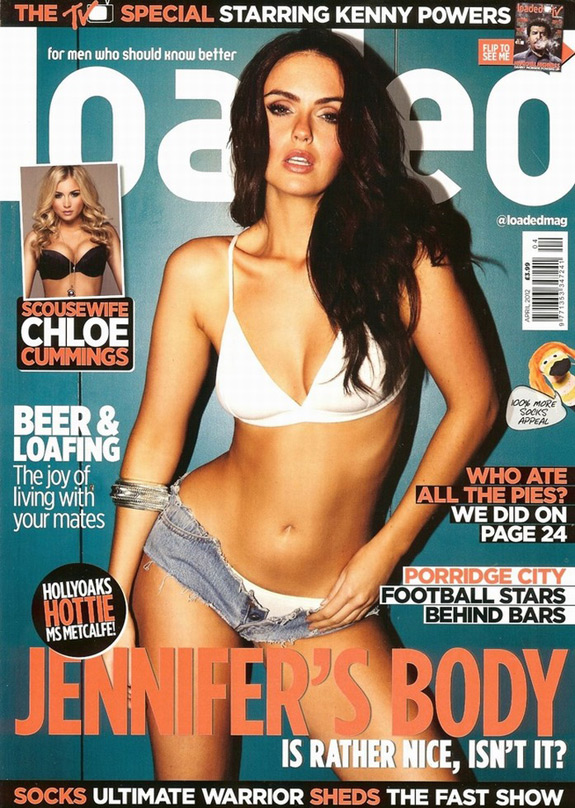
Furthermore the Issues of the CLASH and NME pictured below are in styles that I both admire and would take inspiration from. I especially like the use of Yellow on CLASH and the John Lennon NME. Whilst the use of a calm blue with the greys on the Laura Marling NME I think looks really good.  All the magazines use just a few colours to create a calm effect, which doesn't over complicate or ruin the magazines appearance. 

They also all have bold clear mastheads and throughout use clear fonts, similar to  the style I would like to adopt for my magazine. As well the structures they use with the Loose text on the cover is something I will use. 

I feel these magazines appeal to young people for all of these reasons and is the reason why I like them so much. They are simple but effective, yet still achieve a stylish outcome. But also choose colours and styles that seem like they wouldn't work, but when put together hit it off. This is much similar to the styles of my Target Market., therefore it is clear why these are popular and also reassures me I have chosen the right genre and inspirations for my Target Market. 


The following print screens are from a website called. UK Tribes . The website collates and groups people by their lifestyle choices, such as shopping and TV habbits and was essential during my audience research. The print screens below are of the groups I best feel suit my Indie Genre and helped me most to produce accurate and detailed audience research. 


Audience Profile.

My magazine will be aimed at both genders in order to widen my target market. Although I understand that a magazine featuring an attractive male/female will appeal to the opposite genders. As well as the fact that they have different interests, likes and dislikes. These will all have to be considered when producing my magazine, such as when looking at colours.


Name- Sarah Marriott.

Age- 19

Neck of the woods- Sheffield.

Occupation- Studying Textiles at Sheffield Hallam, in her second year. The partying has calmed down but the enthusiasm hasn't.

Time Killers- Never leaves the house without her camera (or her purse), she was born to shop, but tries to stick of the high street. She loves to see her friends, but "studying is taking over her whole life". Getting home to see her family is everything, but the shops in  Sheffield lure her to stay from Brighton.

Burns a hole in her pocket- CLOTHES CLOTHES CLOTHES, & accessories, loves her quirky bits and bobs. However her cash is going on a new phone, as her current one is 'damaged' (so her mum thinks, a messy night being the real reason).

Future Plans- Would love to work for a fashion company, whether that be in designing or working on the photoshoot. Plus living abroad would be a dream, she'd be on that flight to New York.

Marital Status- Single and chilled.

Favourite Colours- Something that doesn't shout to loud,such as this, this & this

Music to her ears- Laura Marling, Mumford and Sons, Two Door cinema Club, Indie and Folk YES PLEASE. But an Oasis playlist can't be sniffed out.

Stop press:- Someone who likes to be herself and doesn't want to upset others, but if she wants something she's going to get it.. watch this space!


Name- Joe Cardkali

Age- 19

Neck of the woods- Newcastle Upon-Tyne.

Occupation- Studying Geography at Leeds Metropolitan. Not a big party animal, prefers a beer back at the flat with the boys.

Time Killers- Travels the length and breath of the UK following the Toon Army. Loves hitting gigs and went to T In The Park last summer. Can't get his hand out the biscuit tin! Not a big fan of the clubs, prefers to shop than get out of his trolley. Used to board, but that is so year 11..

Burns a hole in his pocket- Football tickets, Gig tickets, Cinema tickets. More a saver, than a big spender, but won't hold his cash if the price is right. Shops in River Island and Well Gosh. Whilst nothing beats some fresh Nikes.

Future Plans- Travel round Europe on the Interail, wants to get into town planning, but enjoys writing so journalism is an option. Just wants to have fun in the sun.

Marital Status- Single boy.

Favourite Colours- Something simple, like this, this and this.

Music to his ears- The Wombats, Friendly Fires, The Killers, The Lumineers and The XX. It's all Indie, but it's a tag he wants to brush off.

Stop press:- Likes to just get in and put his feet up, put the kettle on and let the evening roll. Get the mates round and have a laugh. Often seen popping into the high street for a window shop. Just wants to have some fun and will make the effort to find it. But for him homes where the heart is, a Geordie Lad. Howay the lads.

Music Style Research.


I have chosen to use the genre of Indie for my Music Magazine. I very much enjoy listening to this type of music, as well as liking the styles associated with it, from clothes to album covers and magazines.

I hope for my magazine to appear current and modern, but I don't want it to appear to cheap or manufactured  I want it to be authentic and have a genuine feel. Which is why I may use an element of Folk combined with the Indie genre to create authenticity, as I believe that Indie Rock and Alternative can appear fake. 

The Genre- Indie

Indie is the shortened version of Independent Music.The music is produced independently from the major commercial record labels, as well as any of their subsidiaries. This is often achieved by a 'do it yourself approach' to both recording and publishing of music.

However nowadays when Indie is referred to as a genre term, it may in fact be including music which is not produced independently.

Furthermore because Indie artists create a whole variety of music, these can all themselves fit into different genres.

Also people and items are often called 'indie' referring to the individuality of an action or item possessed.

Indie Artists

The Wombats, Two Door Cinema Club, The Vaccines, The Libertines, The Strokes, and Friendly Fires.

The Wombats.

The Genre- Folk

Folk music includes both traditional folk music  as well as the genre that evolved from it during the 20th Century folk revival.

The actual term first came about in the 19th century, though is often applied to some music which is older than that.

Folk Artists

Bob Dylan, Joni Mitchell, Simon and Garfunkel, Neil Young and Eva Cassidy.

 Joni Mitchell.

The Genre- Folk

Indie folk is a music genre that arose within the 1990s from many singer/songwriters in the indie rock community who were influenced by the folk music scenes of the 1950s, 1960s and early 1970s, as well as country music and indie rock.

Indie Folk Artists.

Ellie Goulding, Wye Oak, The Lumineers, Fleet Foxes, Noah and the Whale, Mumford and Sons, Of Monsters and Men, Laura Marling, Damien Rice, Johnny Flynn, Ben Howard, Frank Turner, Florence and the Machine, Dog is Dead, Bombay Bicycle Club and Benjamin Francis Leftwich.

The Lumineers.

In Summary

Folk artists are often categorised as Indie Folk and will produced music defined as 'Indie. However Indie artists are unlikely to produce anything of a Folk style. Therefore the Genre's do form a joint genre, however this is Folk Merging into Indie, not Indie Merging with Folk.

Meanwhile the styles of artists from both Genre's may be similar, as of such they are not mainstream.


Language Register.

After analysing many other music magazines within the market, some of a similar genre to what I am aiming to create (Indie) and others not so similar (such as Hip Hop), I have come to the conclusion that it will be most viable and suitable to write my text in Standard English. Although some elements of slang and informal language may be used to suit the audience and to some extent the genre, I aim for not to detract from the publications class. I feel writing it  in this style will keep my audience interested, but also make it clear, easy and crucially enjoyable to read. 


Font Analysis.

For my magazine I want to use a clear and possibly bold font, whilst keeping it stylish. I don't want it to be to arty or unusual because I feel this will deter from the impression I want to create. I will use similar fonts throughout my magazine as the one on my masthead, to create continuity and keeping my magazine down to earth.

1.  I liked the 'TRANSFORMERS' font because it conveys power and I also like how the 'T' and 'F' drop below the other letters highlighting the beginning of the two words compounded together to create the one. 

2. I like 'COALITION' because it is bold and strong, whilst I also like the fade along the bottom, giving it an authentic rugged style upon the text.

3. The 'PEPSI' font is good especially the 'e' and 's' which come to life with the font. I could use this in my magazine if I entitle it 'deck' because it would enhance the 'e'. 

4. I liked the techno look on the 'GOOD TIMES' font which I thought was pretty interesting. I also think it could suit my Indie genre.

5. I thought the 'CALL ME MAYBE' font was really good, looking as if it had been created by a whiteboard pen. This do it yourself style could certainly suit the Indie genre. 

6/7. I also admire the bubble fonts of 'Alba' and 'Disko' because they to look as if they were drawn, which once again fits the 'do it yourself' Indie element. I also like the bubble style. 

8. neon is a great font I like the way that the 'e' twists to the side, which again would work if I called my magazine 'Deck'. It also has a techno feel fitting the Indie genre. 

9. I love the 'Simple Kind Of Girl' font because it looks like it has been handwritten. This fits the do it yourself Indie style, but also the simplicity suits a Folk genre. So I especially like this font.  

10. The 'Cocktail Bubbly' font is interesting because of the bubbles emerging from the letters which is something different. Also if I called my magazine 'Burst' this font would be especially appropriate. 

11. Finally 'Easter Fun By Tom' has a small Aztec pattern upon the top and bottom of the letters, which fits the Indie genre as these are quite popular among people of this style.  

Colour Analysis.

For my magazine I will need to choose and then use a colour scheme of 3 to 4 colours. Using 3 colours would accomadate the rule of 3, however it is becoming more and more common that magazines use 4 in order to give the magazine a different dimension.
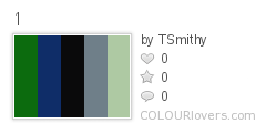
1
Color by COLOURlovers 1. This colour pallet contains 5 colours which I feel go well together, with the two darker colours, then the strong black, as well as the two paler colours. I feel this would certainly fit the indie genre, and more specifically boys/tomboys.

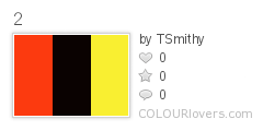
2
Color by COLOURlovers 2. This pallet consists of red, black and yellow. Although these are all bold colours, they can really make a magazine stand out and this is used on many magazines. I feel this would more appeal to boys.

3
Color by COLOURlovers 3. These colours look more dingy, but the mustard yellow would certainly fit a folk element. The colours still create a relaxed feeling.

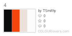
  4
Color by COLOURlovers
 4.This pallet is quite a simple one, however the colours contrast well and the combination of red and black can give something a strong presence on the page.

  5
Color by COLOURlovers
 5.In theory this is a boring pallet, however the colours when matched with a vibrant image can create a aesthetic page. They are also simple but authentic, unlike when too much colour is used.

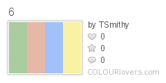
6
Color by COLOURlovers
6. This pallet consists of green, red, blue and yellow, but in a pastel style. This gives vibrant colours a more relaxed feel, Something I feel could suit my magazine, especially for folk.

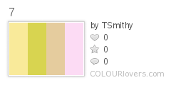
7
Color by COLOURlovers
7. The first three colours in this pallet are quite similar, but with the pink they are given a different edge. The use of the pink makes it more girly, so would narrow my target market.

8
Color by COLOURlovers 8. Again these colours are quite girly, but for an indie genre this can appeal to both boys and girls. I also believe the colours match up well.

Magazine- Analysis of Double Page Spreads.

Analysis of Magazine Double Page Spreads by

Magazine- Analysis of Contents Pages.

Magazine- Cover Analysis.


Analysis of Magazine Covers. by

Female Styles. Mood-board.

Try our slideshow creator at Animoto.

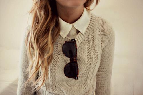
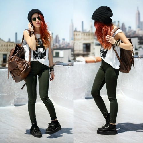
This collection of female clothing styles all come from websites such as Topshop and River Island. They are all styles I like and believe would help to create authenticity in my publication as well as suiting my Indie Genre.

Male Styles. Mood-board.

Make your own slideshow at Animoto.

This collection of male styles all come from websites such as Burtons and River Island. They are all styles I like and believe would help to create authenticity in my publication as well as suiting my Indie Genre.

Artists Styles. Mood-board.

Make your own slideshow at Animoto.

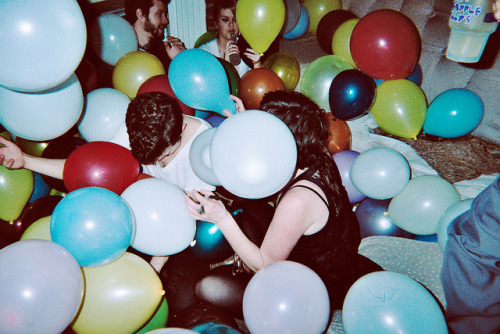
This Mood-board consists of various pictures of artists who have styles that I admire and would consider using in the final production of my music magazine, as they all fir my Genre of Indie.

Album Covers. Mood-board.

Try our slideshow creator at Animoto.

I chose these album covers as I liked the colours that they used and the images that they have created. The designs that they have used are ones I would like to incorparate in my magazines deign and production. I also believe they would suit my chosen genre of Indie.

Indie/Folk Magazine Covers. Mood-board.


Make your own slide show at Animoto. I chose these magazine covers as I liked the colours used, the arrangements, the photograohy and the styles/feelings they created. All elements I would like to adopt and use in the creation of my magazine. I also believe they would suit my chosen genre of Indie.

Monday 14 January 2013

Flat Plan- The Subject.

My Preliminary Flat Plan for my School Magazine, 'THE Subject'. I chose to give a link between the magazines name and the contents page in order to immediately establish an identity. I chose to use green, blue and red, as these colours work well together to create a clear but stylish impression. The red was used as it enables things to stand out, such as in the contents or on the front cover. In addition I chose to use a reference to the magazine being available on tablets as this is currently very popular. This is as I wanted the magazine to appear current and suited to the market place. Whilst the editors section is something very common in many magazines so I included it to give my own one authenticity, as well the Barcode was included for a realistic looking piece. For this same reason I included items such as Strap Lines, a controversial quote and a tag line ('Start reading between the lines'). The latter of these also contributed to giving my text an identity.

Preliminary Magazine- 'THE Subject'

The name for my School Magazine- I have decided to call my school magazine 'The Subject'. I chose this name because it has conntations to the basis of schools which is the subjects that are taught. Whilst also linking to subjects in general, such as the subjects of a text within a magazine. Therefore the two meanings of the word merge into one.

Wednesday 2 January 2013

Colours: Text on Background


Black on white is still the easiest way to present type and to read it and you change that colour at your peril. Using coloured paper, coloured type or a heavy type patch often reduces legibility. In tests carried out by Karl Borgrgrafe (cited in Favre and November 1979) to see which colours worked best together, the following taxonomy of colour mixes was discovered, starting with the most legible, and working through to the least legible.

Black on yellow
Yellow on black
Green on white
Red on white
Black on white
White on blue
Blue on yellow
Blue on white
White on black
Green on yellow
Black on orange
Red on yellow
Orange on black
Yellow on blue
White on green
Black on red
Blue on orange
Yellow on green
Blue on red
Yellow on red
White on red
Red on black
White on orange
Black on green
Orange on white
Orange on blue
Yellow on orange
Red on orange
Red on green
Green on orange

As you can see, black and white comes pretty near the top although the list suggests that a yellow panel behind the black type would improve legibility (which is why important warning signs of danger are usually printed black on yellow.)


From: Designing for Newspapers and Magazines, by Chris Frost, Routledge, 2003


Note: though black on yellow may be more striking than black on white, it is unlikely to be more pleasing in large quantities. Magazine designers have to strike a balance between legibility, impact, and reader satisfaction.
Between getting attention, and not being annoying. CE

Tips and Advice on Layout from Clive Edwards et al


-The first colour is white. The second colour is black. The third colour is red. Calligraphers and early printers grasped this over 500 years ago and experience has proved them exactly right. White for background, black for text, red for accent and excitement. These three colours are the best . Be very careful with all other colours.
Roger Black (designer of Newsweek, Time Out, Esquire, National Enquirer, Rolling Stone)

-A cover should be a poster. A single image of a human will sell more copies than multiple images or all type. Always has, always will. Think about why.
Roger Black

-Never set a lot of text type in all caps. After a while, it’s just too hard to read.
Roger Black

-Use only one or two typefaces. Italian design is the model: a strong sense of a few things that work together. Avoid a free for all of multiple fonts/colours.
Roger Black

-Get lumpy! The trouble with most design is that it has no surprise. If you want normal people to pay attention, you have to change pace in your presentation. Monotonous rhythms of picture, headline, picture, text, ad, headline, picture, ad, etc. Is like a pudding without raisins – a stew without lumps.
Roger Black

-Break up type to add interest
Chris Frost – Designing for newspapers and magazines

-Don’t use too many typefaces. Too much variation will end up looking a mess. It’s best to limit yourself to one font, and variations of it.
Chris Frost

-Emphasise your entry point, with larger intro type, bold faces, drop letters, etc. Choose your entry point with care, and make it the focal point of the page.
Chris Frost

-Even mediocre photographs attract an audience and a good news picture, even on an inside page, may attract 80% of the readership.
Harold Evans – Pictures on a Page

-Just switching type face from serif to sans can result in massive differences in reader comprehension, and response, to advertisements
Colin Wheildon – Are you communicating, or just making pretty shapes? (2005)

-There are few major newspapers in the English speaking world today which use the sans serif type for the body text. Conversely, many major magazines choose sans serif. Serif faces have long been regarded as highly readable. One theory is that the serifs acted as tram lines, keeping the eyes on target. Another was that the modulated thick and thin strokes of serif types provided greater opportunity for individual letters, and hence words, to be distinguished and read.
Colin Wheildon

-Responses to text in printed colours showed a considerably lower level of good comprehension.
81% said they would prefer to read the page of coloured type because it was more attractive. But the test results clearly show that in practise, they found coloured text more difficult to read. It was attractive to look at but did not make a good reading environment.
Colin Wheildon

-Editors and designers are the missing link between the ape world and man.
Colin Wheildon

Every picture should have a caption. Readers get very irritated if they cannot find the caption. But the caption must not state the obvious. A picture of a vicar pouring a cup of tea, should not have for its caption: Vicar, pouring cup of tea. Captions should add to the information in the photo, not re-state it.
Many music mags use witty, tongue-in-cheek captions.
Type size for the body of an article should be between 9-14. (not the headlines, standfirst, crossheads etc). Some newspapers go down to 8, and many would consider that anything above 11 is too large, wastes space, and patronises the reader. 9 is the most common size.

Rule of Thirds and Golden Spiral


So, the first "golden" rule is the "Rule of Thirds" or "Golden Ratio". It affects the ratio (1:1.618) of a picture size, as well as the placement of the main subjects in the photo. This ratio is close to the 35mm ratio, so you don't need to change the size of the photo in most cases. But you need to consider the composition: main subject should lie on one of the four lines or four intersections (subject's eye for example). Truthfully speaking, these rules are not always the same. Rule of Thirds is a simplified version of the Golden Mean.


Another rule is the "Golden Triangles". It's more convenient for photos with diagonal lines. There are three triangles with corresponding shapes. Just roughly place three subjects with approximate equal sizes in these triangles and this rule will be kept.


And one more rule is a "Golden Spiral" or "Golden Rectangle" (you'll see why it's a rectangle in the tools section). There should be something, leading the eye to the center of the composition. It could be a line or several subjects. This "something" could just be there without leading the eyes, but it will fulfill its purpose anyway.

What is creativity? (G325 questions on production work)


Taken from Media Magazine blog.

One of the possible areas you could be asked about in the exam is creativity. The projects you have undertaken will hopefully have felt like an opportunity to display your creativity, but you will need the chance to discuss what you understand by creativity and what it might mean to be creative.

The assignment options at AS and A2 all offer constraints for your work, whether it be making pages for a music magazine, the opening of a film or the packaging for an album; one of the reasons why you aren't offered total free choice is because people often find that working within constraints gives them something to exercise their creativity, whereas total freedom can sometimes make it really difficult to know where to start. It's why genre can be interesting- how has something been created which fits with certain structures and rules but plays around with them to give us something a little bit different?

The word 'creative' has many meanings- the most democratic meaning would really suggest that any act of making something (even making an idea) might be seen as a creative act. In more elitist versions of the term, it is reserved for those who are seen as highly skilled or original (famous artists, musicians, film-makers etc). an interesting third alternative is to think about how creativity can be an unconscious, random or collaborative act that becomes more than the sum of its parts.

A great shared site for creative random art with some effort is on Flickr with the shared CD meme pool. This is a game where you create a CD cover for an imaginary band and upload it to Flickr; the trick is you have to create it from 'found' materials, again following a set of rules.

1. Generate a name for your band by using WikiPedia's random page selector tool, and using the first article title on whichever page pops up. No matter how weird or lame that band name sounds.
2. Generate an album title by cutting and pasting the last four words of the final quote on whichever page appears when you click on the quotationspage's random quote selector tool. No matter what those four words turn out to be.
3. Finally, visit Flickr's Most Interesting page -- a random selection of some of the interesting things discovered on Flickr within the last 7 days -- and download the third picture on that page. (Even better: Click on this link to get a Flickr photo that's licensed under Creative Commons.) Again -- no cheating! You must use the photo, no matter how you feel about it.
4. Using Photoshop (or whatever method you prefer), put all of these elements together and create your very own CD cover, then upload it to the CD memepool


My version:


Margarita Rosa de Francisco

Milk's Leap Toward Immortality


Ideas and theories to help you.

"A process needed for problem solving...not a special gift enjoyed by a few but a common ability possessed by most people" (Jone 1993)

"The making of the new and the re arranging of the old" (Bentley 1997)

"Creativity results from the interaction of a system composed of three elements: a culture that contains symbolic rules, a person who brings novelty into the symbolic domain, and a field of experts who recognise and validate the innovation." (Csikszentmihalyi 1996)

"There is no absolute judgement [on creativity] All judgements are comparisons of one thing with another." (Donald Larning)