Wednesday 27 February 2013

Huck Magazine Impression.

My own Huck Impression.
  

Screen Grabs of Magazine creation.


Coursework Update.

18th Febraury- 22nd February


  • Completed work on the inspirations for my work. 
  • Conducted Audience Feedback (Questionaire)
  • Peer assessed other students Blogs
  • Evaluated other students assessment of my work and displayed this on my Blog
  • Updated my Blog with my 1st Draft Teacher Feedback
  • Composed a plan of action for my work and the necessary improvements that need to be made. 
  • Started to make improvements to the Front Cover of my Magazine. 


  • Reduced size of Barcode. 
  • Adjustment of text at the bottom of the page.
  • Enlargement of Masthead "DECK".

Sunday 24 February 2013

Plan of Action for Necessary Improvements

After receiving my first draft back with all the teacher feedback and having conducted audience feedback through a questionnaire, as well as being peer assessed. I have created a plan of action to improve my magazine and complete a professional, authentic and credible final piece. Whilst I have also included my successes to ensure nothing was missed out.

Front Cover

The Successes- I feel the name of my magazine proved popular and the audience feedback against it was favourable with support for it fitting the genre. The actual layout of the cover was also looked at positively with people liking the minimalistic style, as well as the few colours and clear fonts that were used. People also supported the professional style and authentic feel the Front Cover provides the magazine.

The Improvements- First and foremost the size of the barcode needs to be dramatically reduced as it is currently too big and looks unprofessional, especially on a minimalistic cover. I will make the masthead bigger to make it clearer and stand out more prominently, as some people found it difficult to differentiate between itself and the "DRONE PIXIES TEXT". I will work to adjust the lines of text at the bottom of the magazine, as it currently looks quite chunky and out of place, so by adjusting the spacing's and amount of lines will improve this. Also I will retake my photo for the front cover, as the hair is a bit flyaway and doesn't look as professional as some magazines, so this needs to be addressed to make the hair sleeker, increasing the magazines authenticity.


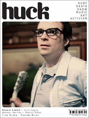
Looking at the magazines above, if you look at Rolling Stone and Wonderland (Special K), both of the cover stars have really sleek and glossy hair. This will only have been achieved through work on the hair before the shot was taken, this looks professional as the hair is still stylish but not messy. However with the K MAG and Wonderland (Dakota Fanning) the hair is bit messy but more defined that it is on my magazine, therefore it works very well. Even on the Nicky Minaj Wonderland her hair is an extravagant pink and is very curly, but it is well kept up and looks held together well, as a result it looks professional and makes the magazine authentic. The final two magazines DAZED and SPEX feature cover stars where the hair is relatively flyaway. However it fits the feeling of the rest of the cover, as the makeup used on DAZED is bizzare, whilst on SPEX the text is spaced around unusually. Therefore the flyaway hair is appropriate on these covers. Almost if it was sleek and smooth it would look out of place and not suit the cover.Overall though looking at all these covers it is essential I get my Cover Stars hair to look sleek and smooth, as this best fits the current and Indie style I'm trying to create through this professional authenticity.


Additionally I will look at altering the colours, as some people said they were quite bland, although if I do alter any colours I will have to consider the whole of my magazine, to make sure continuity continues.

Contents Page:

The Successes- The layout of the Contents Page was popular with the majority of the audience, with people saying it looked professional and authentic. Whilst it included all of the necessary information (e.g. the twitter name) adding vital credibility to the publication. People also commented on the colours and how they contrasted each other well, achieving a nice balance on the page, making it easy to read. I was also pleased how the font choice continued to work and fit the genre suitably, carrying on the magazines continuity.

The Improvements- The image will need to be changed because as of now it looks quite similar to the image upon the Front Cover and is not very exciting. As well variety is needed in the images, so it would need to have different artists, whilst also using varied shot types, as currently all the shots are very similar. I will look at making more impact to the text under the main headings in the Contents not as much because of how they look but more about what they say, to make it more punchy. Furthermore I will experiment with altering the layout, such as moving the image and sections of text, to see how they may fit better elsewhere. I will even look at a different choice of font, but as with changing the colours on the Front Cover, I will have to consider the whole publication as I don't want continuity to be lost. Whilst the web address needs to be adjusted in order to make my magazine more authentic and credible.

Double Page Spread:

The Successes- I managed to continue the continuity of my publication throughout the Double Page Spread which I felt was important in a minimalistic magazine, to create the professional look. The large quote was also popular in the audience questionnaire and people even wanted more in some cases, whilst I was also pleased with the large letter to start the article, which looked authentic and professional. The same characteristics were achieved through the use of page numbers on the Double Page Spread. I personally liked the style of the article and the balance, but in hindsight changes need to be made.

The Improvements- The layout of the article needs to be improved, it needs to be two or three columns of equal length and width, to make it look far more professional and authentic. Whilst the content and balance of the article needs to be adjusted to improve it significantly  It needs to be more focused around the music, as opposed to the hardship in her life, making it less heavy to read. So more questions need to be included in the interview in order to focus upon the music and increase authenticity to that of an actual music magazine. In addition the sub-heading of the article needs to be changed to have more impact, both through the content and the aesthetics of it. The image needs to be changed as it is of low quality and again looks like the front cover, so needs to be altered to create variety and a current, credible magazine. Meanwhile the layout needs to be improved on the Double Page Spread. As of now the image crosses the fold of the page, as does the subheading, which currently looks quite scruffy and rough. This must be changed to enhance authenticity and make my publication credible, as this just makes it look unprofessional. Finally to increase credibility and authenticity further I could add the web address and Twitter name to the bottom of the page, as is a feature in a lot of actual publications, to make my magazine professional.


1st Draft Teacher Feedback

Front Cover Teacher Feedback


  • Try making the masthead a bit bigger.
  • Make image larger slightly.
  • Sort out styling of hair, it needs to look less flyaway in places. 
  • Barcode is too big (long).
  • Either justify all lines or make the last one the smallest- See fantastic man for help.
Contents Page Teacher Feedback


  •  Variety Needed in images across package ( better to have different artists and variety of shot types.
  • Need to think about layout- I like it but it's not quite right yet. 
  • Text [contents sub-text] needs more impact,

Double Page Spread


  • Two/three columns of equal length.
  • Not enough text in interview.
  • A bit bland should have more impact [subheading].
  • A bit heavy [article, first half].
  • Make it more about music, to much on hardship in life! [article, first half].
  • Blank Space, why?

Overall Teacher Feedback

  • Gap at top and bottom [Front Cover] need to be equal- Shrink Bottom.
  • New photo- Sleeker hair, no need for camera, softer lighting.
  • Look at web address.
  • Collumns need to be more balanced. Aligned. 

Peer Assessment

Comments on my blog from fellow peers.

Comment 1

I will definetly reduce the side of the barcode as it looks silly, out of place  and unprofessional. Changing this will make the magazine more authentic. 


Comment 2


It is one of my main priorities to alter the image upon the double page spread. As when combined with the text it doesn't quite look right. 


Comment 3


Re-positioning the image was not something I was looking at personally, but is something I will now experiment with. Whilst changing the image to enhance my magazines authenticity and credibility is something I am certainly leaning towards.


Comment 4


Adjusting the layout on the double page spread is one of my key priorities, the overlap of text and image is far from ideal and will be addressed. As will any other technical problems on the spread, in order to create a professional publication. 


Comment 5


Re-organising the article is an essential to improve the double page spread. Currently the text looks out of place and a bit stuck onto the image, rather than working in conjunction. 


Comment 6


I believe the colour scheme is one of my magazines best assets  however audience feedback did bring up opposition to this, which will be looked at, as some said it seemed to boring and simple. So more extravagant colours will be experimented. 


Comment 7


Although the name Dustlands is quite sad, I felt it suited the genre which was the most important element to me matched. However I will look into other names, as well as definetly altering the style and balance of the article. 


Wednesday 20 February 2013

Audience Feedback

Magazine Feedback Questionnaire

1.     Do you like the name of the magazine? Is it long enough?

100% of the audience feedback agreed that the magazines name was of a suitable length and they liked it. People commented it was, "Snappy", "Catchy" and "Punchy".


2.     What are your thoughts on the Front Cover layout? Does it look professional?

50% of people thought that the front cover looked professional, with 30% of people commenting on the how they liked the font.


3.     Do you like the main image? If not why not?

80% of those questioned said they liked the image. Those who didn't would have preferred a larger image or one that filled the whole front cover.


4.     What are your thoughts on the fonts and colours used? Would you change them?

40% of people commented how the front cover font was quite boring and needed more colour. Whilst others said how the colours complemented each other, making it easy and clear to read. 


5.     What are your thoughts on the Contents layout? Does it look professional? Is it easy to read?

80% of those surveyed said they liked the layout, it was professional and easy to read. Other people said that it was maybe a bit empty and would have re-positioned the image towards the bottom of the page.
6.     Do you like the main Contents image? If not why not?

90% said they liked the image used on the contents page. 10% said that it was quite similar to the image upon the front cover, so needed changing.

7.     Is there any information missing from the Contents Page?

100% of people questioned said that the contents page didn't require any further information.


 8.     How would you improve the Contents Page if you were to buy the magazine?

50% of people commented that they wouldn't change the contents page. The other 50% noted how it needed more colour, a change of image/more images and required more text regarding the content.

9.     Do you like the main image on the Double Page Spread? If not why not?

80% said they were in favour of the image. The 20% who didn't wanted more expression in the image, it and the text to swap positions and for it to be shot from further out.

10.    What are your thoughts on the Double Page Spread layout? Does it look professional? Is it easy to read?

100% of people surveyed said that they liked the layout, becuase it looked professional and was easy to understand/navigate. Whilst people liked the larger quotes, though more colour was suggested by 10% of people.


11.    Do you like the style of the article? Is it good to read?

80% said they liked the style of the article, with the remaining 20% wanting more colour and a longer article.

12.    How would you improve the Double Page Spread if you were to buy the magazine?


60% of people questioned were not sure how they would improve the double page spread's layout. With the remaining 40% commenting how a better quality image was needed, more colour is needed in the text and the image and put more emphasis on the title "DRONE PIXIES".


Summary


Overall it seems the Front Cover was the favourite part of the magazine for the audience, with the name, fonts and colours all proving popular choices, with only small percentages disagreeing with this. However the image was questioned by some and is something I will look to change, whilst also tweaking the layout to avoid large empty spaces and technical inaccuracies. In order to create a thoroughly professional final piece.


The Contents page in general received positive critique, with people enjoying the professional layout and how all the information required was present. Also the colours were popular with some and they enjoyed the contrast created but others thought they looked quite simple, so a change could be looked at. Whilst additionally people commented how they liked the image, but it was similar to the image on the front cover, so a change could be in order.


Finally the Double Page Spread was the least popular section. People wanted a more diverse image, with a more interesting layout, including more colour. All things I will seek to improve. As well as improving the quality of the article to make it more professional and more interesting to read for the audience. This section is where I feel more improvements need to be made and will change most drastically.


Friday 15 February 2013

Magazine Playlist


Side A

1. The XX - Angels. 

2. Laura Marling - Devils Spoke 

3. Laura Mvula - Like the Morning Dew  

4. Night Beds - Ramona 

5. Fleet Foxes - Ragged Wood 

6. Duffy - Serious

7. Kodaline - Perfect World 

8. Florence and the Machine - Kiss with a Fist

9. The Lumineers - Slow it Down 

10. Mumford and Sons - Timshel 

11. Noah and the Whale - Blue Skies 

12. The Wombats - Little Miss Pipedream 

Side B

1. Milo Greene - 1957

2. Evaline - There There 

3. Zoom - Last Dinosaurs

4. Coldplay - Hurts Like Heaven

5. The Killers - Dustland Fairytale 

6. The Vaccines - Aftershave Ocean 

7. Alex Trimble - Caliban's Dream 

8. Foster The People - Don't Stop (Color On The Walls) 

9. Friendly Fires - Live Those Days Tonight

10. Sniffy Dog Ft. Adrien - Little Boxes 

11. Miles Kane - First of my Kind

12. Two Door Cinema Club - What You Know